If you’re not already selling your products or services online, you should know that ecommerce will make up 95% of all purchases by 2040*. What does this suggest? It’s simple – start selling online sooner rather than later.
However, you can’t just build any old website and expect the sales to come flooding in. By understanding the latest ecommerce web design trends, you can create an online store that attracts customers and leaves your rivals in the dust. Conversely, using outdated trends might risk your business falling behind.
We know how important your business website is to you. That’s why we’ve done all the research and selected nine of the hottest ecommerce web design trends to help you on your way. We’ve also provided useful tips, powerful stats, and real life examples for that extra boost of inspiration.
The 9 hottest ecommerce web design trends in 2021 are:
- Centred navigation menus
- Asymmetrical layouts
- Minimalism
- Interactive design
- Micro animations
- Dark mode
- Advanced chatbots
- Engaging filter functions
- Multi-directional layouts
Now, let’s discuss each of these trends in greater detail…
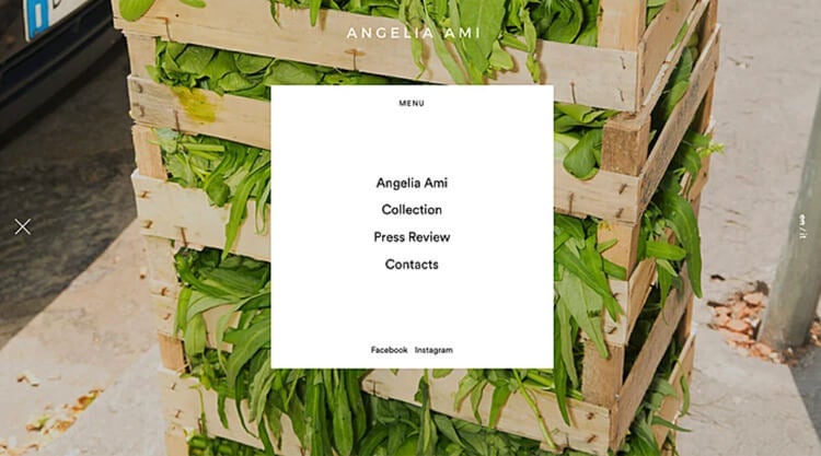
1. Centered Navigation Menus

In previous years, the done thing was to have your navigation menus tucked away in the top or side banner. While easy to find, the menu would be an afterthought for most visitors.
Here are three ways your website could benefit from a centered navigation menu:
- Enables visitors to find what they’re looking for quickly and easily
- Simple navigation encourages quicker purchases
- Makes smartphone browsing even easier for the user
In fact, 71% of smartphone users are more likely to convert (buy something) if they can make a fast purchase – i.e., if they can find the right product quickly. This is one of the easiest ecommerce web design trends to introduce while creating your business website.
2. Asymmetrical Layouts

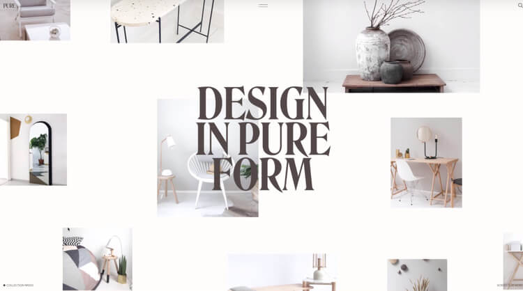
Asymmetry is one of the more risky ecommerce web design trends. When done incorrectly, it can look untidy. When done just right, it can make your site look super modern and give your business the edge.
We’ve got three tips to help you nail your asymmetrical layout:
- Overlap elements and contrast large headers with smaller images
- Use plenty of empty background space
- Remove the spacing, known as gutters, within the design interface’s grid layout to give you more freedom (see image above)
If you don’t have the right skills to design asymmetrical layouts, then we strongly recommend you get expert help to avoid damaging your brand image.
We can put you in touch with professional web designers who’ll do all that for you. All you need to do is tell us what you’d like from your website using our free comparison tool. You’ll then get more information from suitable designers, and no-obligation quotes for you to compare. It’s quick, easy, and free to get started.
3. Minimalism

You’ve heard that less is more. But did you know that less could mean more sales? Minimalist design not only helps users find your products more easily, but it can also make your site’s pages load more quickly. It’s a cheap and easy trend for small business owners to nail down, particularly if you’re concerned about the overall cost of web design.
These days, consumers are more impatient than ever. When it comes to website loading speed, studies show it takes just one second of waiting for users to lose focus on a task, and just ten seconds for them to give up and leave the site entirely. This shows that reducing clutter can, ultimately, keep customers on your website for longer, because pages cluttered with elements will take longer to load.
Here are three tips on how to nail a minimalist website design:
- Use color to guide users, rather than more elements
- Contrast extravagant typography against whitespace
- Implement flat textures and avoid shadows or gradients
4. Interactive Design

Consumers enjoy interacting with brands. Plain and simple. Interactive design is all about creating a positive user experience (UX), which can do wonders for your brand image and sales figures. On average, every $1 spent on UX returns $100.
Here are three ways you can use interactive design to your advantage:
- Explain a product’s benefits with a 3D image
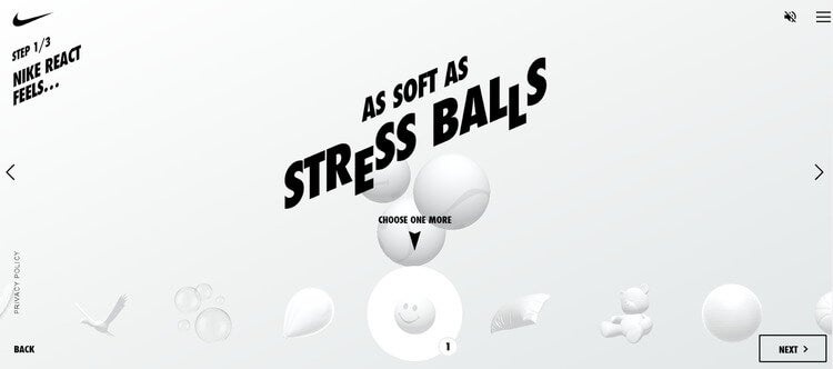
- Encourage micro interactions (see image above) to understand what your customers want
- Use an interactive video to tell your brand’s story
Interactive design requires a reasonable level of web design skill, but top web design agencies can create this easily for you. We’d say that this trend is suitable for small businesses that have a relatively large web design budget.
5. Micro Animations

Just like you would in your brick-and-mortar store, you ought to keep your website visitors entertained in order to prevent them from leaving and spending money elsewhere. Using micro animations to catch the visitor’s eye can help you do just that.
Popular types of micro animations include CTA (call to action) buttons that become animated when clicked, or an email icon that turns into a flying paper plane when a message is sent.
We spoke with Gordon Bonnar, Senior Digital Designer at Parkhouse, who believes micro animations are one of the most important ecommerce web design trends:
Introducing micro animations can enhance the overall user experience, as they can prevent ‘busy fingers’ during loading or processing time. By making areas of the process or journey more visual, it in turn becomes more engaging.
6. Dark Mode

Dark mode is one of the most contemporary ecommerce web design trends, turning online stores into eye-catching, eye-friendly websites.
Dark mode works particularly well on OLED screens, which, unlike LED screens, don’t use a backlight. The most recent smartphones come with OLED displays, making this trend ideal for targeting smartphone users.
Why is this important? Because by 2023, it’s predicted that mobile commerce will account for 75% of all ecommerce sales. This trend could be an effective way to shine the light on your website and leave your rivals in the dark.
Here are three ways dark mode can boost your online store:
- It gives your store the creative edge over the competition
- It’s an easy way to make important elements stand out
- It benefits customers using OLED screens by saving their battery
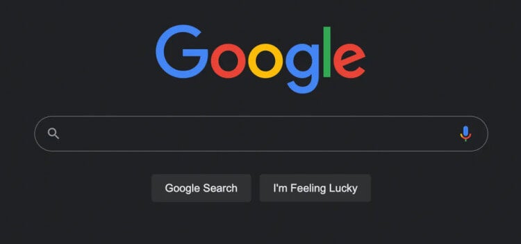
Even Google has turned to the dark side, having introduced its dark mode feature earlier this year (see image below). If Google’s doing it, then it must be a popular trend for 2021.

If you’d like your online store to use dark mode, but you don’t know how to go about it, we can match your business with suitable web design experts. Simply tell us what you need using our free comparison tool, and you’ll receive more information and free quotes from suitable designers. It only takes a minute, and it’s free to get started.
7. Advanced Chatbots

Chatbots are nothing new. But in 2021, AI (artificial intelligence) technology has become so advanced that some brands are using chatbots to help complete the buyer’s journey. See the image above for an example.
While not affecting the design of your site, advanced chatbots are still one of the most impressive ecommerce web design trends. Basic chatbots are relatively cheap to build, but for an advanced chatbot to help assist with transactions and pushing sales, you’re looking at around $1,000 to $5,000+, which comes with ongoing support and maintenance from the chatbot agency.
With these figures in mind, we recommend advanced chatbots to medium or large businesses, or small businesses that want to invest heavily in AI.
Here are the top three benefits of using advanced chatbots:
- Improve the customer experience with rapid, tailored responses
- Enable staff to focus on other tasks
- Boost sales by taking more orders via the chatbot
8. Engaging Filter Functions

Filtering is one of the most important ecommerce web design trends, helping customers find products quickly and easily. However, although practical, using a simple drop-down menu won’t ‘wow’ anyone.
Going the extra mile in designing your filter function could be the difference between keeping a customer on your website, or losing their interest. An engaging filter function will hook visitors immediately, keeping them on your website for longer. And we all know that normally leads to more sales.
Here are three ways to create a fun filter function:
- Build a personalized, click-activated journey, like the image above
- Use sliders to help the user to search for specific metrics like price, weight, or color
- Enable the user to build the product themselves as they go (only suitable for businesses that sell personalized products)
9. Multi-Directional Layouts

Brands are becoming more adventurous with their product galleries, allowing customers to scroll in more directions than just up and down. Left, right, diagonally, forward, and backward – you can let loose with your layouts to improve the buying experience.
This ecommerce web design trend ties in with trend #6 (interactive design), enabling your customers to interact with your catalog and scroll in different directions. Sounds fun, right?
Here are three benefits of using multi-directional layouts:
- It’s ideal for mobile users who are swiping with fingers (in 2020, mobile commerce overtook desktop in terms of traffic)
- It keeps customers engaged and improves the user experience
- It gives your online store the creative edge over the competition
Ecommerce Web Design Trends: Final Thoughts
In 2021, the majority of ecommerce web design trends focus on engagement. Whether that’s engaging customers through interactive design or fun filters, it always pays to get your customers more involved during the online buying process.
Implementing some of these trends should help your online store to stand out from the crowd, encouraging repeat purchases. It should also increase the likelihood of word-of-mouth marketing, in which visitors recommend that their friends and family check out your website.
Whether you run a small store or an ecommerce empire, nailing the latest ecommerce web design trends is one of the many ways you can help keep your website looking fresh, your customers coming back, and your profit margins booming.